
2D density plot
definition - mistake - related - code
This page is dedicated to a group of graphics allowing to study the combined distribution of two quantitative variables. These graphics are basically extensions of the well known density plot and histogram.
The global concept is the same for each variation. One variable is represented on the X axis, the other on the Y axis, like for a scatterplot (1). Then, the number of observations within a particular area of the 2D space is counted and represented by a color gradient. The shape can vary:
2)3)5) or contour plots (6)
Here is an overview of these different possibilities
# Libraries
import numpy as np
import matplotlib.pyplot as plt
from scipy.stats import kde

# Create data: 200 points
data = np.random.multivariate_normal([0, 0], [[1, 0.5], [0.5, 3]], 200)
x, y = data.T

# Create a figure with 6 plot areas
fig, axes = plt.subplots(ncols=6, nrows=1, figsize=(21, 5))

# Everything starts with a Scatterplot
axes[0].set_title('Scatterplot')
axes[0].plot(x, y, 'ko')
# Thus we can cut the plotting window in several hexbins
nbins = 20
axes[1].set_title('Hexbin')
axes[1].hexbin(x, y, gridsize=nbins, cmap=plt.cm.BuGn_r)

# 2D Histogram
axes[2].set_title('2D Histogram')
axes[2].hist2d(x, y, bins=nbins, cmap=plt.cm.BuGn_r)

# Evaluate a gaussian kde on a regular grid of nbins x nbins over data extents
k = kde.gaussian_kde(data.T)
xi, yi = np.mgrid[x.min():x.max():nbins*1j, y.min():y.max():nbins*1j]
zi = k(np.vstack([xi.flatten(), yi.flatten()]))

# plot a density
axes[3].set_title('Calculate Gaussian KDE')
axes[3].pcolormesh(xi, yi, zi.reshape(xi.shape), cmap=plt.cm.BuGn_r)

# add shading
axes[4].set_title('2D Density with shading')
axes[4].pcolormesh(xi, yi, zi.reshape(xi.shape), shading='gouraud', cmap=plt.cm.BuGn_r)

# contour
axes[5].set_title('Contour')
axes[5].pcolormesh(xi, yi, zi.reshape(xi.shape), shading='gouraud', cmap=plt.cm.BuGn_r)
axes[5].contour(xi, yi, zi.reshape(xi.shape) )
# save
plt.savefig("IMG/density2d.png")
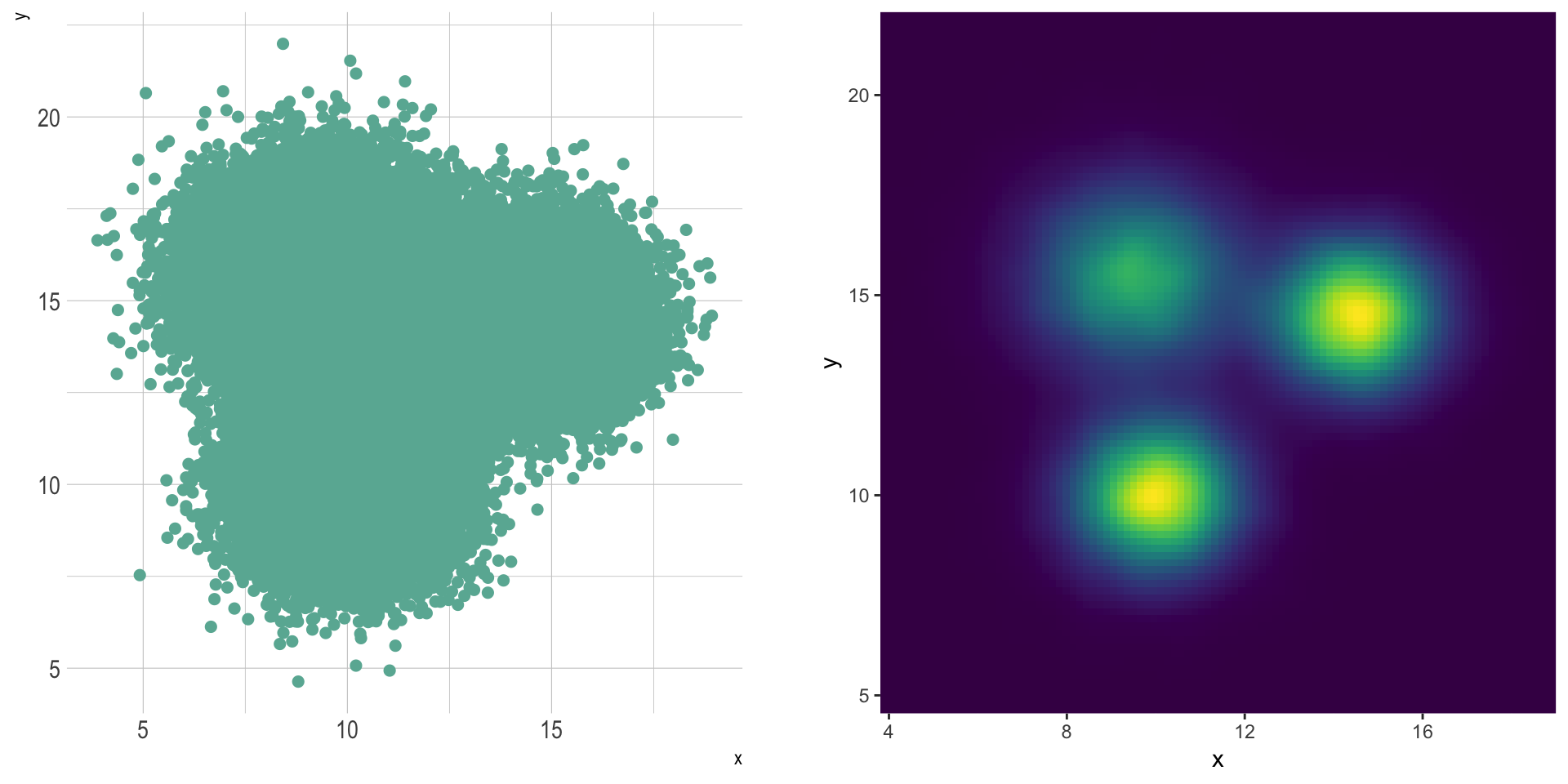
2d distribution are very useful to avoid overplotting in a scatterplot. Here is an example showing the difference between an overplotted scatterplot and a 2d density plot. In the second case, a very obvious hidden pattern appears:
# Libraries
library(tidyverse)
library(hrbrthemes)
library(viridis)
library(patchwork)

# Dataset:
a <- data.frame( x=rnorm(20000, 10, 1.2), y=rnorm(20000, 10, 1.2), group=rep("A",20000))
b <- data.frame( x=rnorm(20000, 14.5, 1.2), y=rnorm(20000, 14.5, 1.2), group=rep("B",20000))
c <- data.frame( x=rnorm(20000, 9.5, 1.5), y=rnorm(20000, 15.5, 1.5), group=rep("C",20000))
data <- do.call(rbind, list(a,b,c))

p1 <- data %>%
  ggplot( aes(x=x, y=y)) +
    geom_point(color="#69b3a2", size=2) +
    theme_ipsum() +
    theme(
      legend.position="none"
    )

p2 <- ggplot(data, aes(x=x, y=y) ) +
  stat_density_2d(aes(fill = ..density..), geom = "raster", contour = FALSE) +
  scale_x_continuous(expand = c(0, 0)) +
  scale_y_continuous(expand = c(0, 0)) +
  scale_fill_viridis() +
  theme(
    legend.position='none'
  )

p1 + p2
2d distribution is one of the rare cases where using 3d can be worth it.
It is possible to transform the scatterplot information in a grid, and count the number of data points on each position of the grid. Then, instead of representing this number by a graduating color, the surface plot use 3d to represent dense are higher than others.
In this case, the position of the 3 groups become obvious:
library(plotly)
library(MASS)

# Compute kde2d
kd <- with(data, MASS::kde2d(x, y, n = 50))

# Plot with plotly
plot_ly(x = kd$x, y = kd$y, z = kd$z) %>% add_surface()The R and Python graph galleries are 2 websites providing hundreds of chart example, always providing the reproducible code. Click the button below to see how to build the chart you need with your favorite programing language.
R graph gallery Python gallery
Any thoughts on this? Found any mistake? Disagree? Please drop me a word on twitter or in the comment section below:
A work by Yan Holtz for data-to-viz.com